Elbkind Reply
Brand Revamp and Guidelines for a Social Media Advertising Agency.
Brand Identity
Social Media
Creative Direction
Design
Edit + Motion
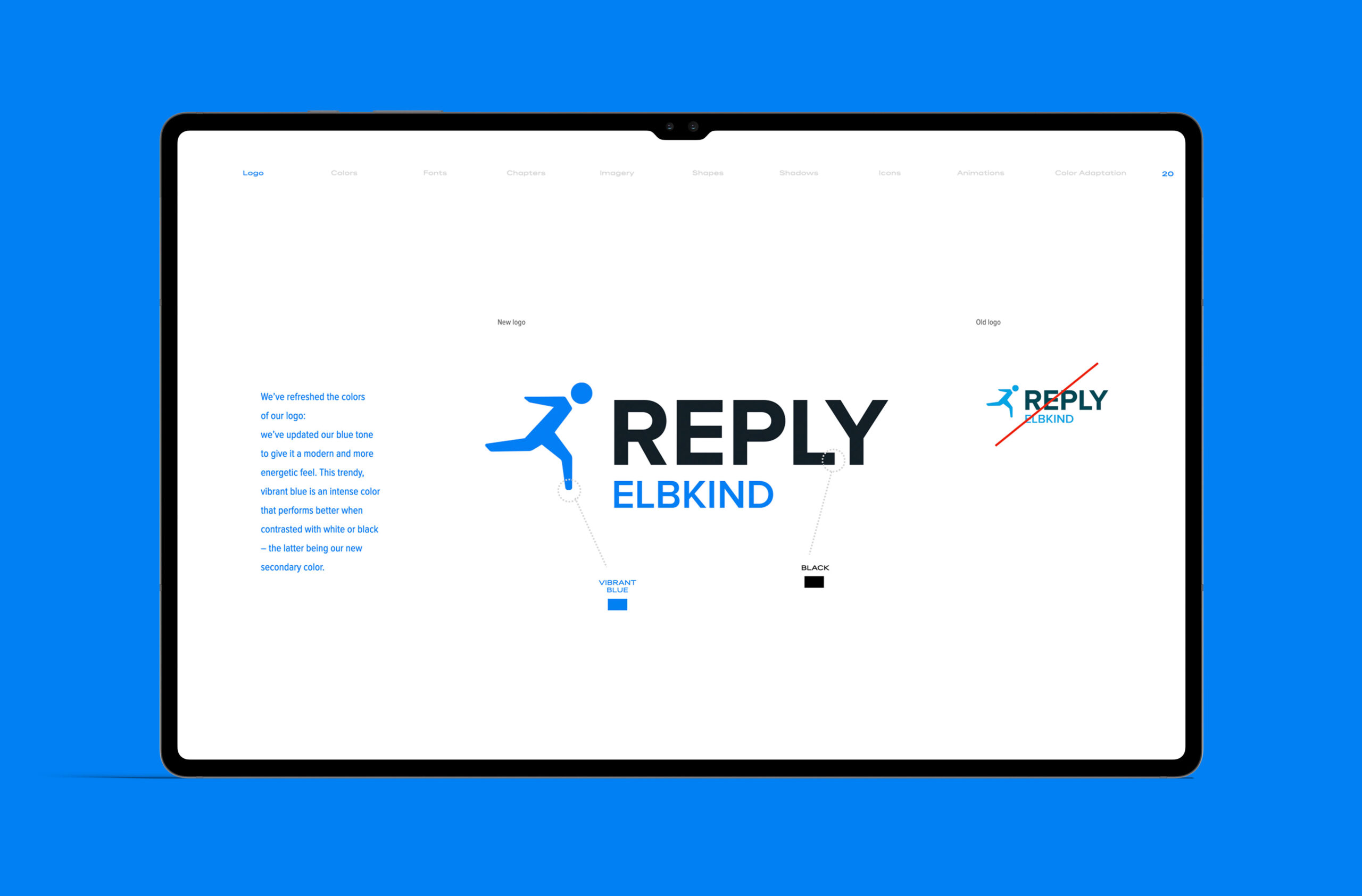
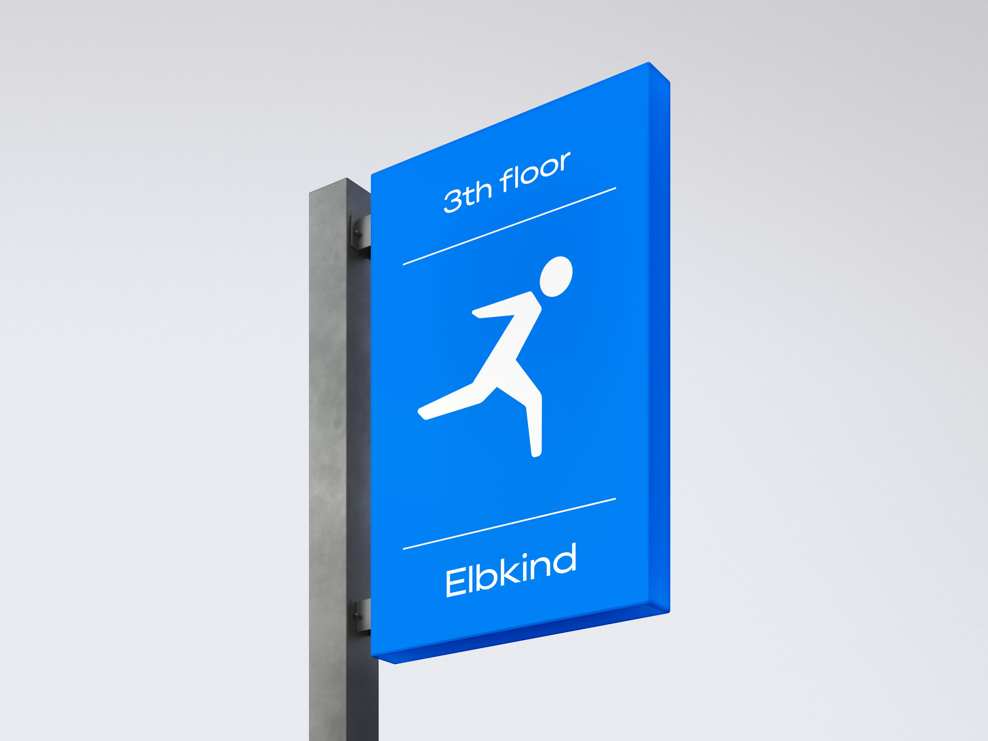
Elbkind Reply is undergoing a significant reorganization to better serve new clients and projects, and I am leading a brand makeover both internally and externally. The primary objective is to present the agency as modern, elegant, and high-quality, aiming to attract new clients and enhance overall performance. We began by updating our blue color to a more vibrant and energetic hue, creating a dynamic look that pairs well with white or black. This refresh aims to make the Elbkind brand clearer, simpler, and more appealing, guided by new comprehensive guidelines for all team members.
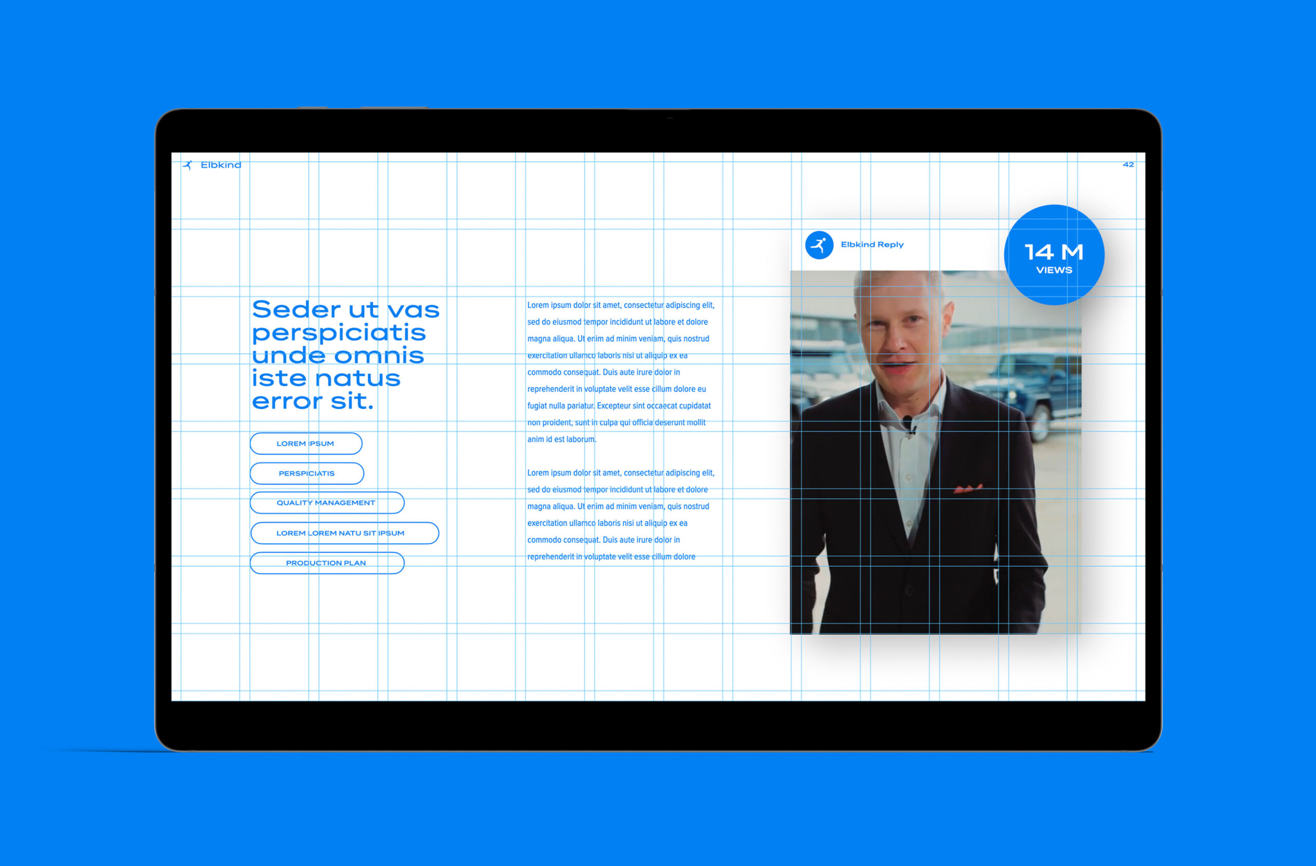
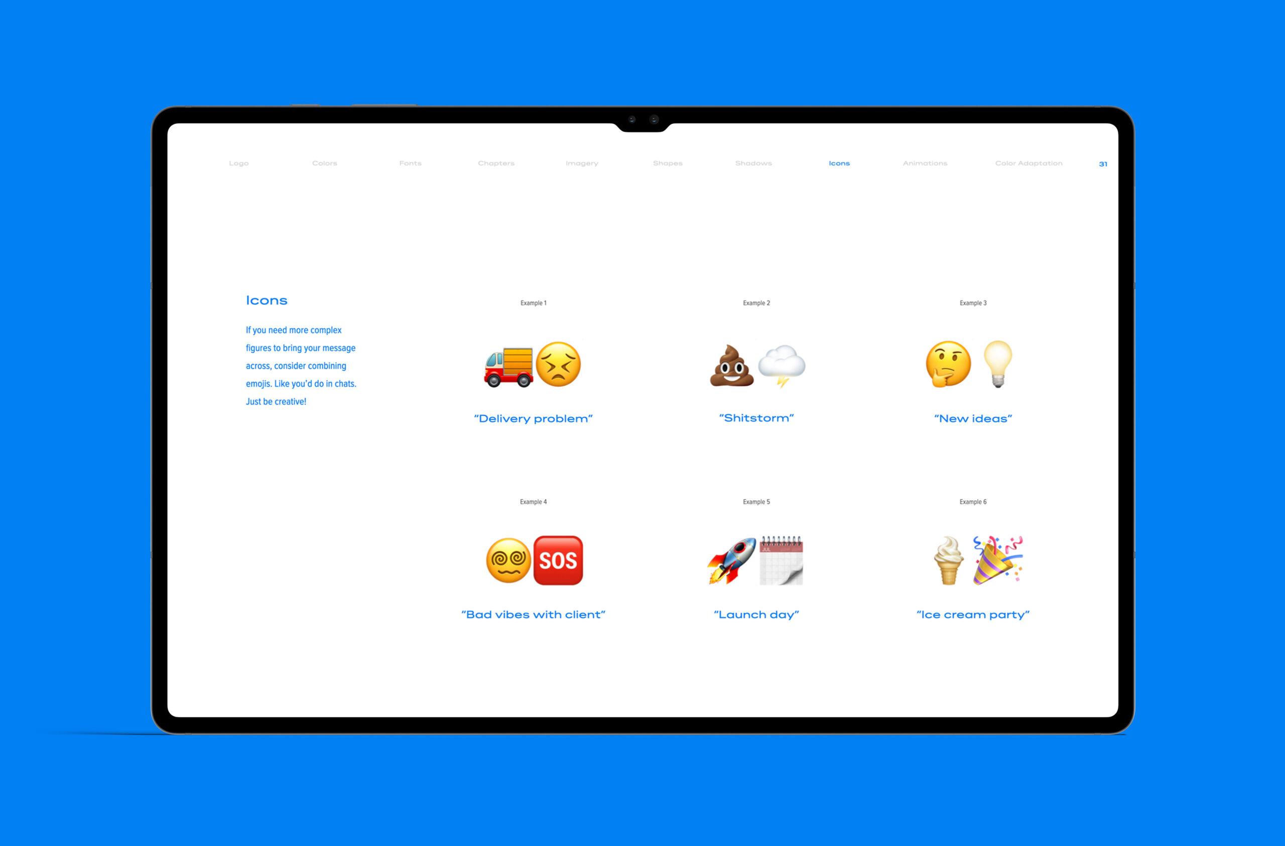
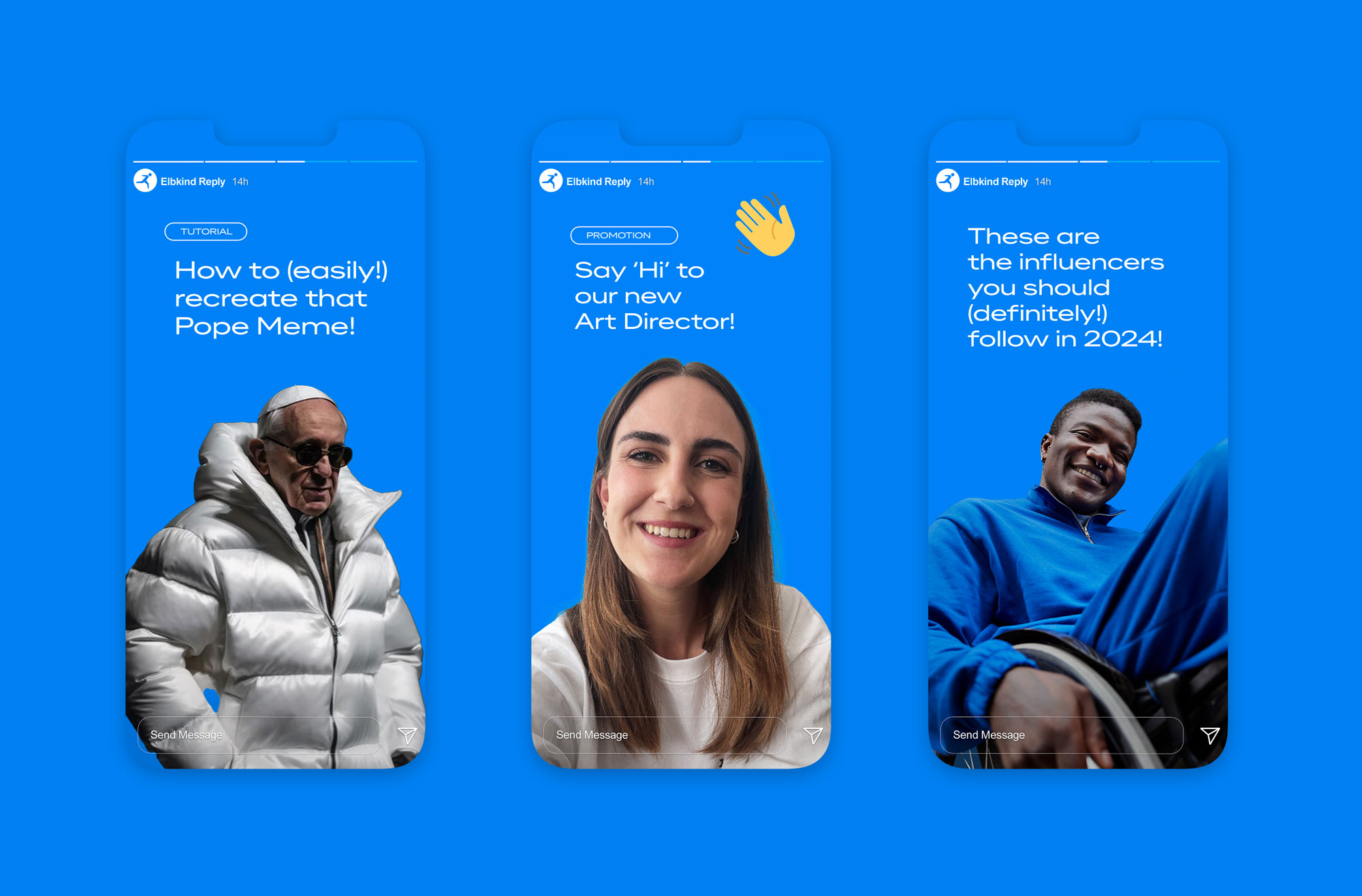
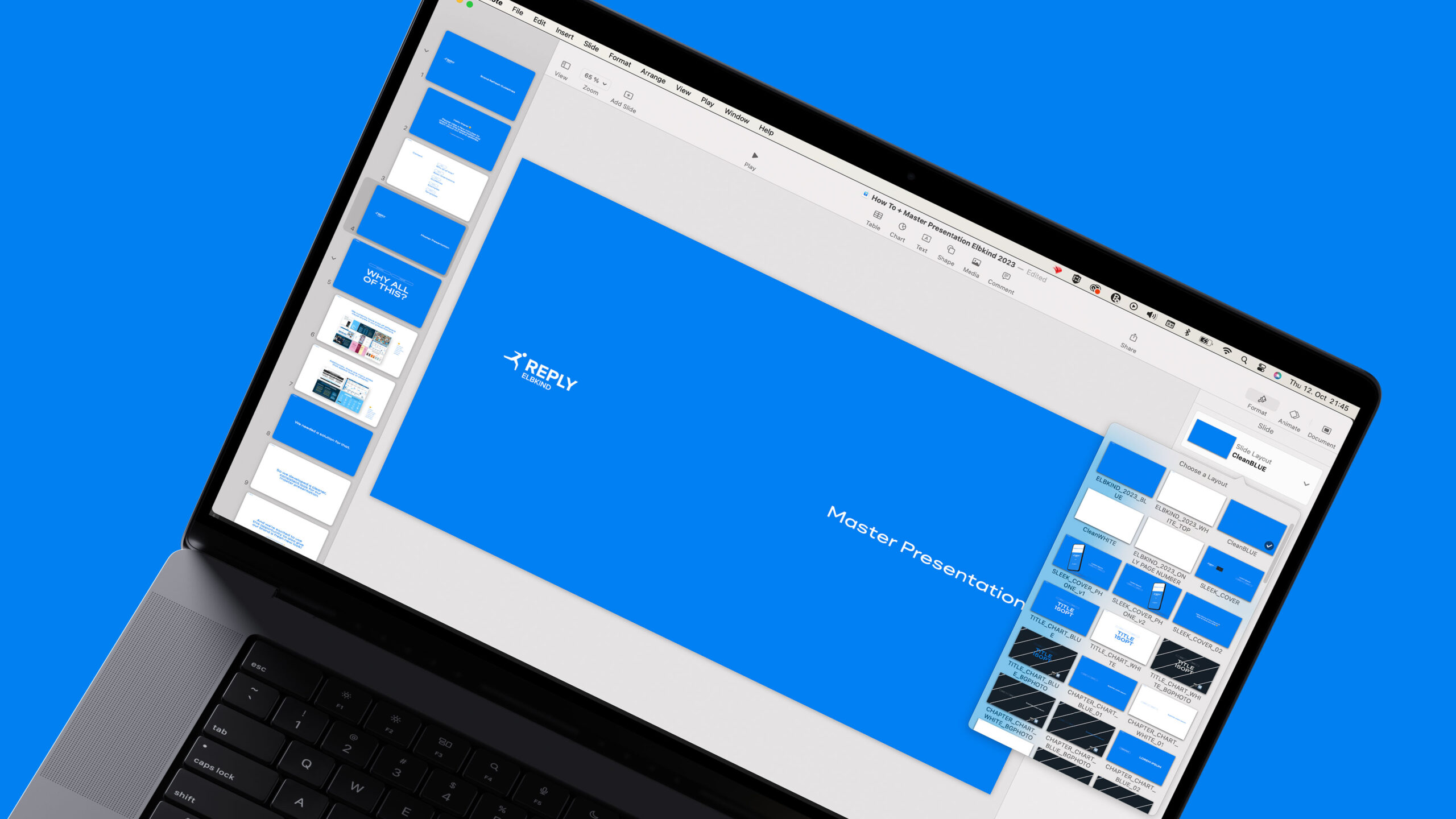
A key challenge in this project was crafting a document that portrays the agency smartly and beautifully, highlighting internal work. We designed and created various visual elements, considering how the brand appears on social media and offline. Additionally, we developed an extensive Keynote and PowerPoint file with over 100 editable slides and templates for cohesive and consistent presentations. This ensured that all departments could produce user-friendly, intuitive content while adhering to the new brand guidelines.
Agency: Elbkind Reply
Creative Team:
Gabriel Costa
Selina Hilger
Afe Deji
Ope Aluko
© 2024
